

SAMSUNG SMARTTHINGS
SmartThings Developer Site Redesign (UX/UI for Samsung)
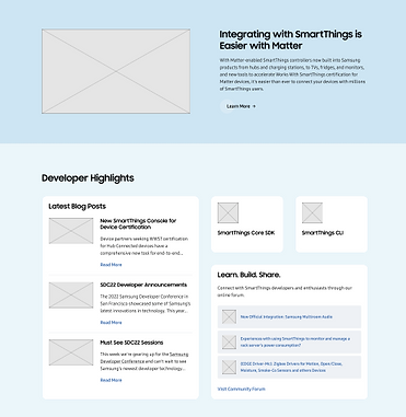
OVERVIEW
I collaborated with the Samsung SmartThings team to help redesign their Developer Portal
the main hub for engineers, partners, and device makers integrating with the SmartThings ecosystem.
Due to confidentiality agreements, I’m unable to share detailed case study content, but the visuals presented reflect my contributions to UX/UI design, content restructuring, and layout refinement.
The goal was to modernize the interface, improve information architecture, and better serve both new and returning developers with simplified access to tools, docs, and certifications.
PROBLEM
The original SmartThings developer site was dense, difficult to navigate, and heavily text-driven. For new users, it was overwhelming to figure out how to get started with device certification or find the right SDK. Returning developers also struggled to quickly locate updates, tools, or documentation relevant to their integration path.
The redesign aimed to fix this by improving discoverability of key resources, promoting SmartThings’ certification process, and making success stories and developer highlights more visible and engaging.

UNDERSTANDING THE USER
SmartThings serves a mix of audiences:
-
Hardware engineers building smart home devices
-
Developers integrating their products with SmartThings APIs
-
Partner brands seeking certification for consumer-ready devices
These users needed fast access to technical content, step-by-step guides, and trust in the platform’s developer support. I prioritized clean layouts, scannable content blocks, and prominent CTAs to help all audiences find what they need without friction.


FINAL
OUTCOME
Here are a few key takeaways and results from my work on the SmartThings redesign project:
The redesigned SmartThings Developer Portal now features a clearer path for first-time users, stronger visual grouping of resources, and more modular content components for future scalability. The overall design is lighter, more modern, and user-centric — helping SmartThings better serve their growing developer ecosystem.
This project reminded me of the power of clear information architecture in technical products. Sometimes, the biggest design win isn’t in how a page looks, but how easily it helps people find what they need. I also learned to work within strict brand systems while still advocating for layout changes that improve usability.
Designing for a global brand like Samsung pushed me to prioritize both structure and scalability — and to approach even the most technical content with a user-first mindset.